“Sheet” Mobile Component
A sheet helps people perform a scoped task that’s closely related to their current context.
Non-full-screen modal sheet: This type is used to display a small amount of information, such as showing additional details or offering extra actions.
Full-screen sheet: This type of sheet is used when there’s a substantial amount of information to display, and it’s essential to utilize the entire screen height.
Non-modal sheet: Non-modal sheets are used in complex interfaces when it’s necessary to directly impact on the current task in the parent screen.
Anatomy

1. Scrim (Optional) is a dark background that emphasizes the tasks on the bottom sheet, it is divided into Modal / Non-Modal depending on the scrim.
Scrim work = Modal
Scrim don’t work = Non-Modal (Interactive)
2. Handlebar (Optional) if a handlebar exists, the "Expandable Sheet" will be displayed for users.
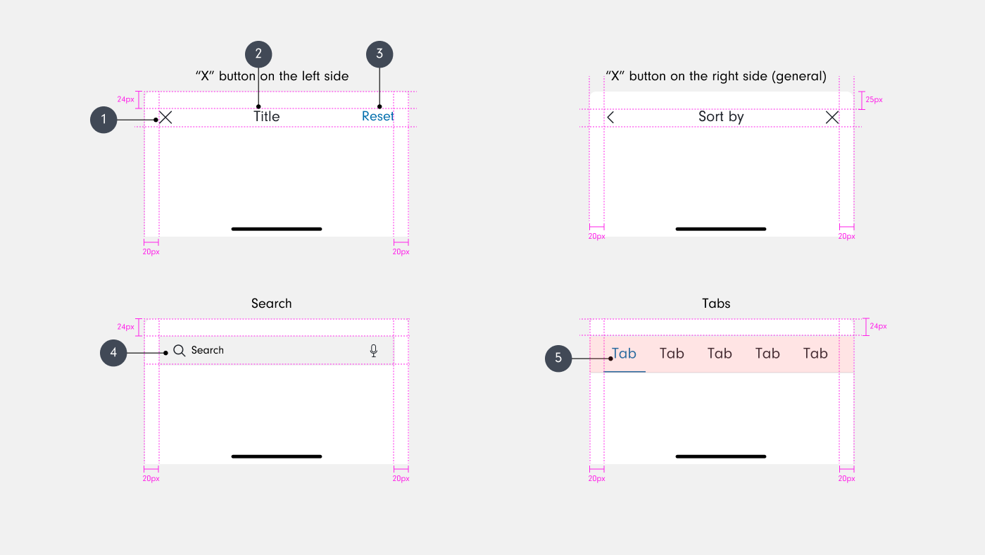
3. Header area (Optional) serves as a navigating bar and its space is divided into Left / Center / Right.
Left: Text, Icon Button, Center: Title, Right: Text, Icon Button
4. Sheet is a surface containing content related to the previous screen.
5. Contents area can be freely configured like an ordinary screen. If the content exceeds the height of the sheet, scrolling becomes possible.
6. Button area (Optional) is an area where the Floating Fullpage Button can be displayed.
User Case- Sort
"Sort By" Bottom Sheet
Scenario: Users need to quickly reorder the displayed content based on common attributes such as price, popularity, or date.
Bottom Sheet Content:
The sheet contains a list of sorting options such as "Name: A-Z", "Name: Z-A", etc.
Each option can be a simple clickable list item.
User Interaction:
Tapping on a sorting option immediately applies that sort order to the items.
The sheet dismisses automatically after a selection is made.
User Case
Expanded "Filter" Bottom Sheet
Scenario: Users need to apply multiple filters to refine search results extensively, which requires more complex interactions.
Initial Bottom Sheet Content: Presents primary filter categories like "Brand", "Price Range", "Size", etc.
Expandable Sections:
Each category can be expanded in-place by tapping, revealing detailed filtering options such as checkboxes, sliders, and switches.
User Interaction:
Users can expand multiple sections at once to apply different filters.
Changes are applied by tapping an "Apply Filters" button, which also dismisses the sheet.
A "Reset" button is available to clear all selections within the expanded filter sections.

Do
Bottom sheet is fixed at the bottom of the screen and appears over other UI elements.
Header area can be skipped, and it can be arranged from the contents area.

Don’t
Fixed position at the bottom and left/right gap cannot be changed.
Element Pattern
Dimmer & Handlebar

Modal and interactive types are determined by the use of dimmer.
Handlebar is used to adjust the layout of the screen in terms of the position. Handlebar can be selected or unselected for all types of bottom sheets.
Header Area/Button Area

Header area
The header area can include a navigation bar.
An "X" button is placed on the right by default. However, if it is used in conjunction with a button that progresses the tasks on the right, move it to the left. Therefore, the "X" button can be placed anywhere in terms of design. However, if it is to be located directionally with two or more buttons, irrespective of whether it is on the left or the right, it should be placed in the most peripheral area.
The <"(Back) button must be placed in the far left.
Button area
Button area can have horizontal or vertical buttons.
Vertical buttons grab more attention, and they are recommended for a lot of contents.
Horizontal buttons are recommended for simpler bottom sheet.
Home indicator can be selectively added to the button area.
Options

Text, Image List
Title and description
In addition to basic elements including an image, text, and button, you can use additional elements for the bottom sheet. It will perform as per respective additional elements.

Grid
Module and expanded types are available as grid.
List
List offers various options.
Design Specs
General

Flexible Width: The width is adjustable based on the screen.
Auto Height: Height is automatically set according to the content and image. It can be set between 0% and 100% excluding the safe area such as status bar. When the bottom sheet is taller than the maximum height of a device, the scroll bar should appear without exceeding the maximum height.
Header Area
Icon
Iconography: Changeable
Size: UnchangeableTitle
Typhography: Changeable
Size: Unchangeable
Color: ChangeableLink text
Typhography: Changeable
Size: Unchangeable
Color: ChangeableSearch: Follows Button rules
Tabs: Follows Button rules
Options

Button: Follows Button rules
Image Area
Background Fill: Changeable
Default: None
Provided Size:
16:9 - W 375px, H 210px
4:3 - W 375px, H 281px
1:1 - W 375px, H 375px
3:4 - W 375px, H 500px

Grid Text
Typhography: Changeable
Size: UnchangeableGrid Icon
Iconography: Changeable
Size: Unchangeable
Color: ChangeableList: Follows list rules
Behavior
Appear / Disappear
When you tap the close button or the dimmer, the modal disappears soon.
Expandable
Handlebar is used to expand the screen.
You can drag the handlebar to expand the screen.
It can be expanded up to the full-height, depending on contents.
If you scroll or drag beyond the top of the bottom sheet, you can expand the screen. (Optional)
You can dismiss the bottom sheet by dragging the handlebar down when the scroll bar is at the top.
Expandable
You can dismiss the bottom sheet by dragging the handlebar down when the scroll bar is at the top.
The bottom sheet can fix if it is not valid to close the modal by dragging the handlebar down depending on the content.